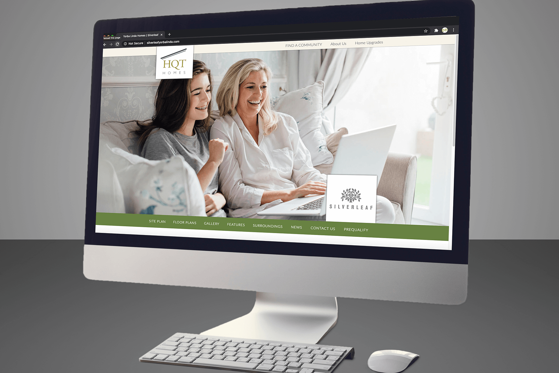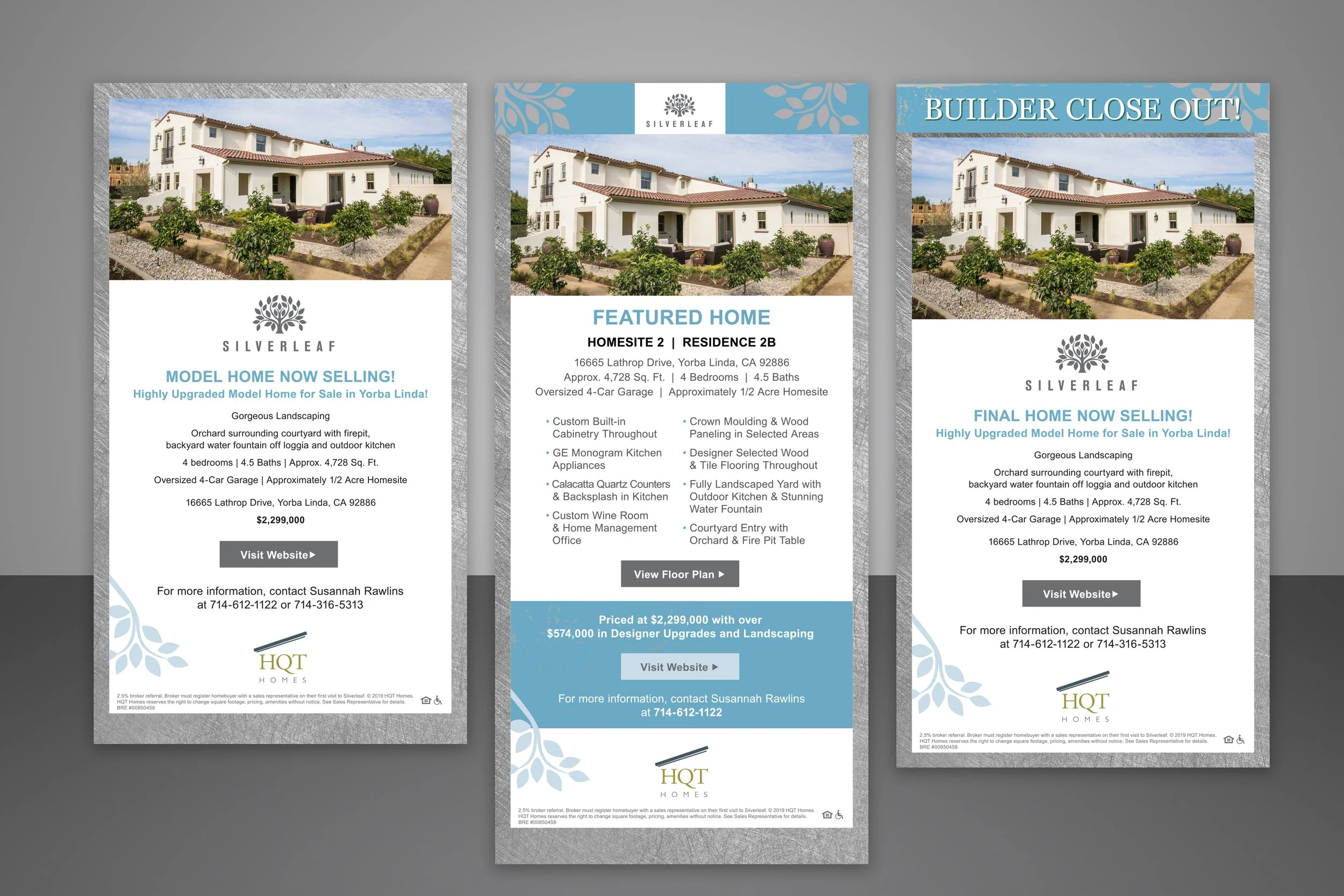
Silverleaf, set in one of CNN’s named Best Places to Live in the U.S, Yorba Linda, is a small enclave of expansive semi-custom homes with an abundance of luxury features. The homes commanded a premium price for this mid-field builder.
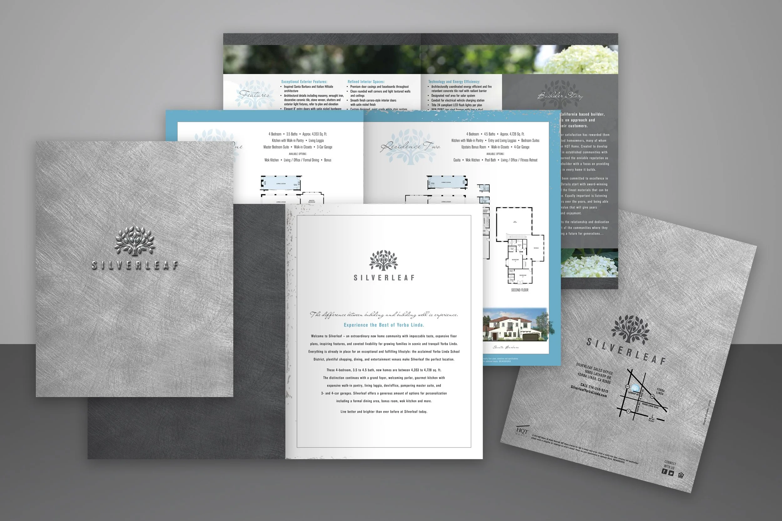
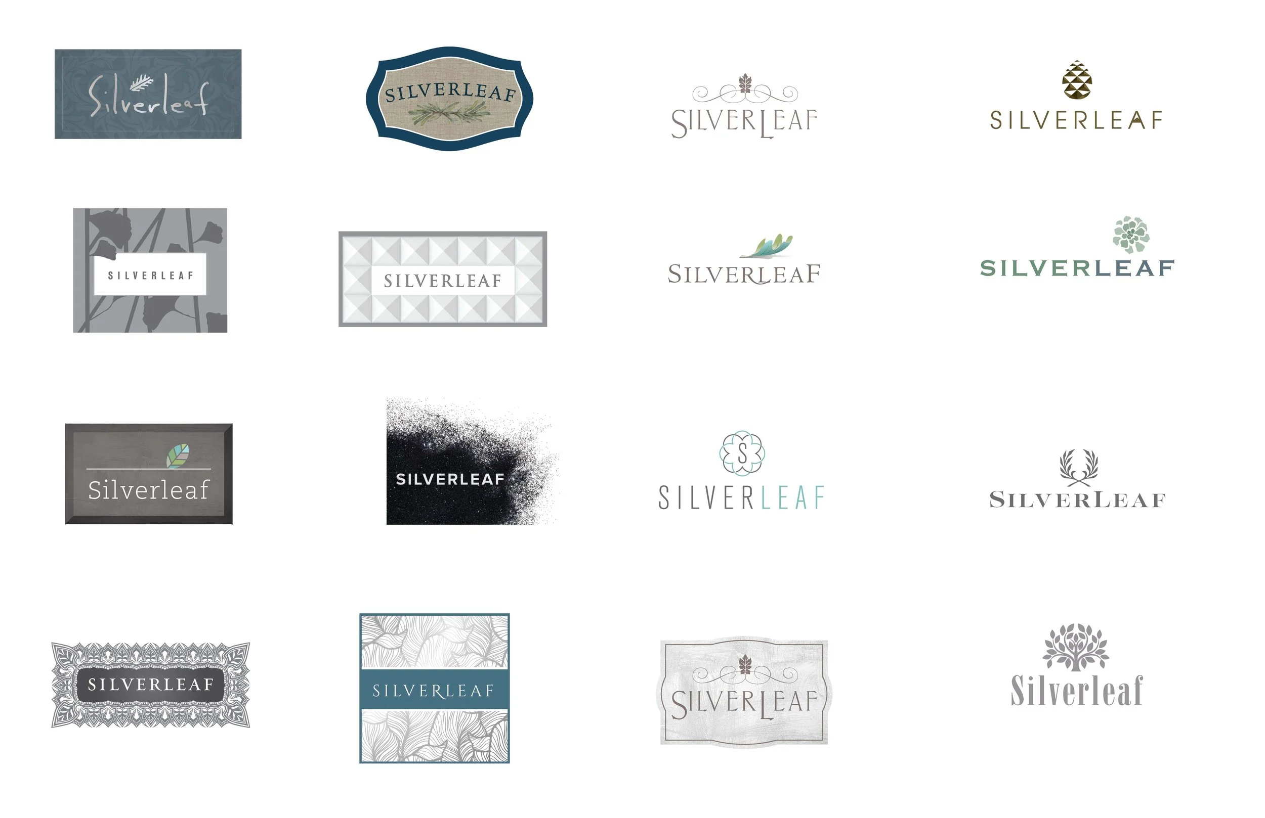
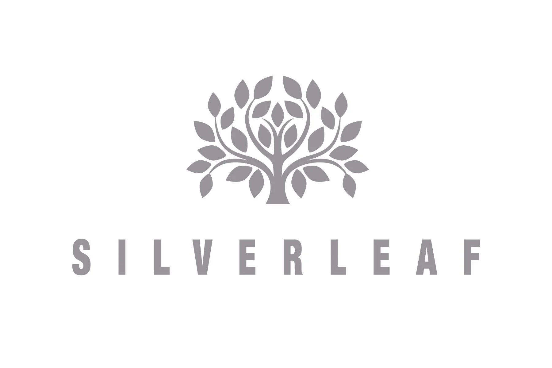
The logo study explored literal options more familiar to them — silver + leaf — stylized in various ways and more abstract options to offer an elevated feel. Ultimately, the client enjoyed the silver tree and what it symbolized for the development, large extended families, expansive amenities, and mature growth. And as it goes, the client wanted to mix and match, choosing this clean, bold, san-serif typeface for Silverleaf. As an added bonus, this logo was included in the 2021 version of Logo Lounge.
Stock photography included images of curated gardens and older families. Embossing the brochure cover with metallic surface elevated the minimalist clean branding and colorstory.