
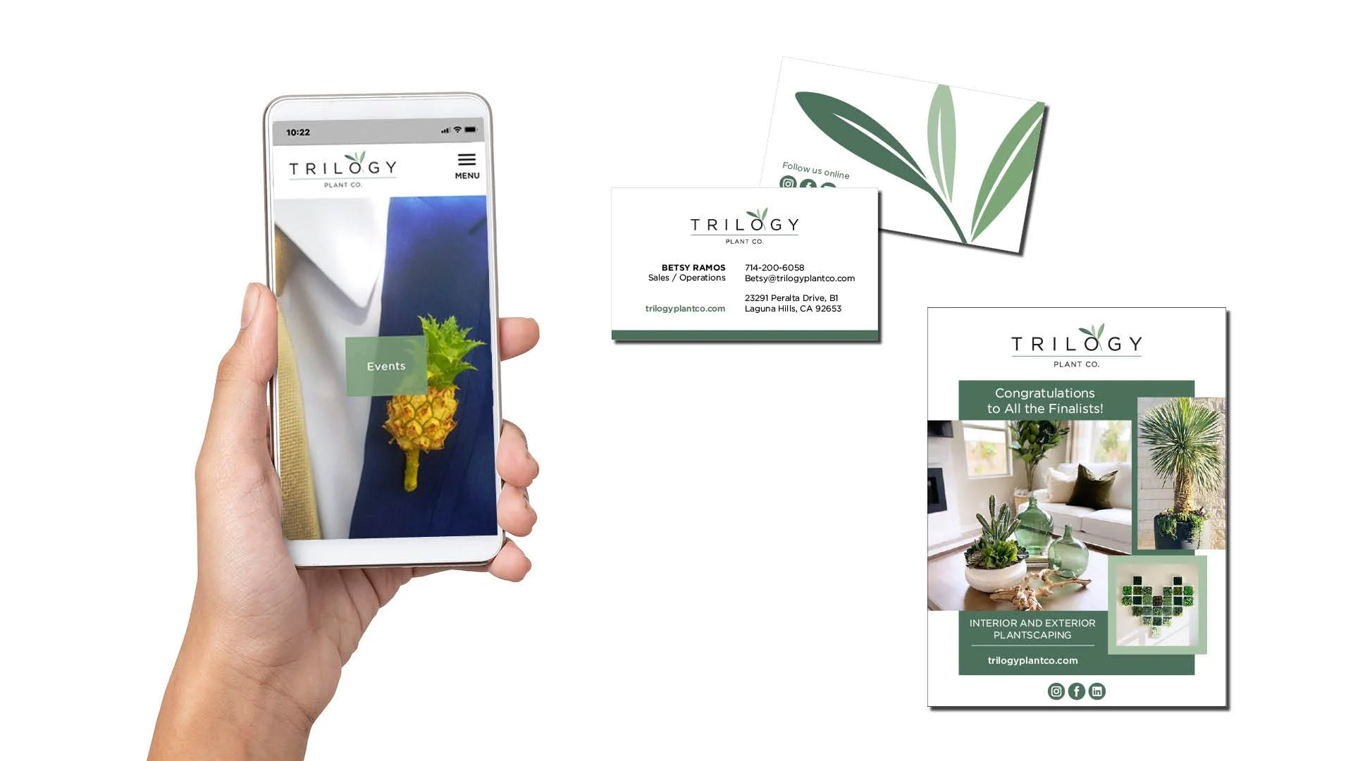
Trilogy Plant Co was the brainchild of three close friends who were already working in similar capacities. In starting their business, they wanted their branding to reflect their bond. The mark brings together three minimalist leaves interconnected and supported. Sophisticated and fresh, the mark communicates their mission of creating living beauty for their clients.
The soft trio of sage greens expresses the growth and confidence of Trilogy Plant Co. The sans-serif logotype, with its beautiful round ‘O’, reinforces the whole experience of creating imaginative plantscapes that elevate built spaces to improve their clients’ lives.