
Bloom South Coast Metro
The challenge was to lure busy professionals looking to flourish in this new urban sanctuary. Set in a bustling, highly desirable location for its proximity to world-class shopping, entertainment, arts, as well as the airport and the ocean, the competition is fierce. The quiet tranquility of Bloom South Coast Metro was a definite attraction for their retreat away from it all.
Scope
Vision+Positioning
llustration
Branding
Identity
Website
Print Collateral
Digital Media
Role: Art Director
Team:
Principal | Concept Manager | Copywriter | Graphic Designers | Programmers
Inspiration:
The location’s street name (Sunflower), agricultural history, warm organic vibes
Results
Fast lease up with a growing community of young professionals
Gold Awards at The Nationals for best website & best graphic continuity
bloom SCM Identity
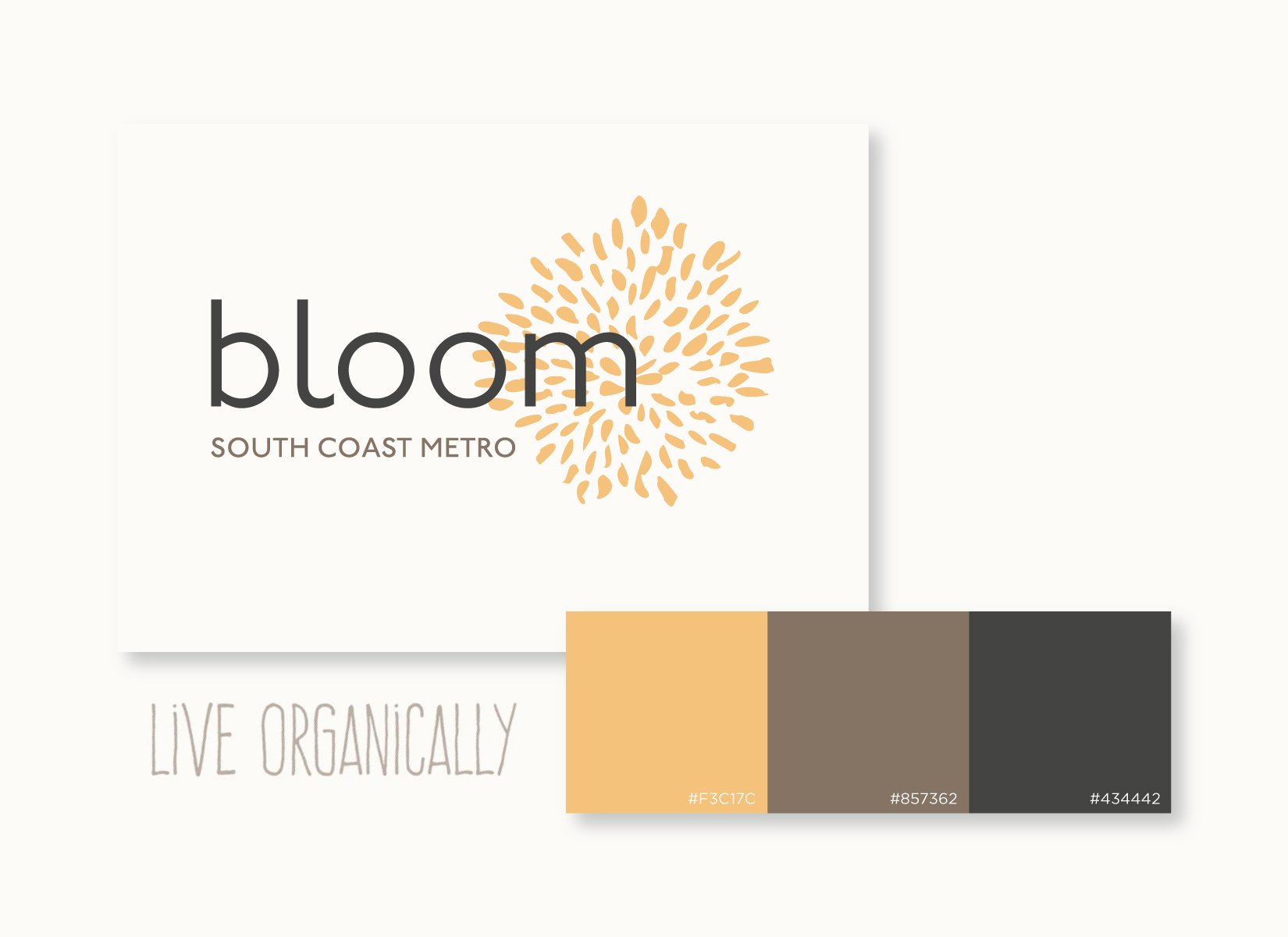
bloom SCM Identity
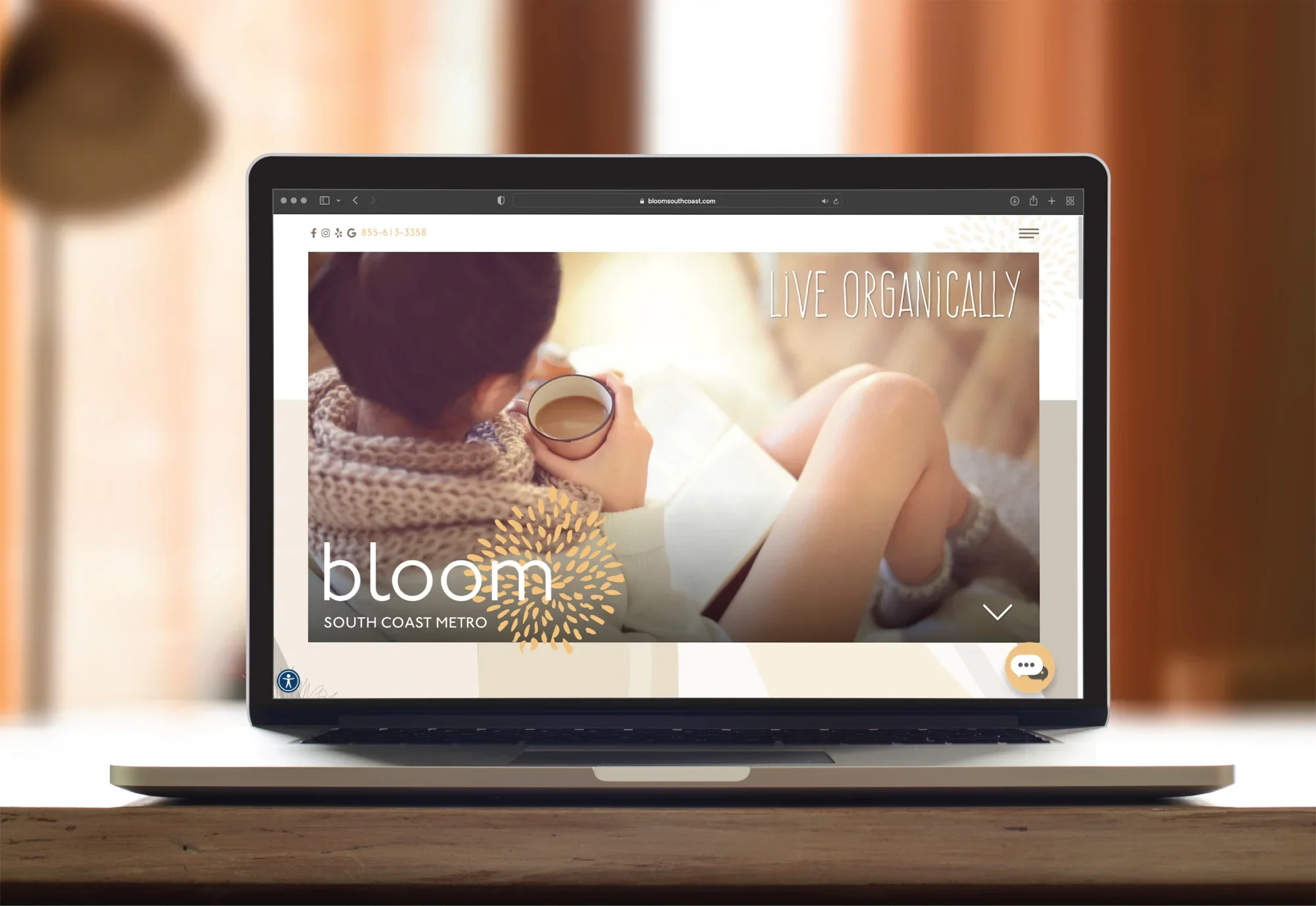
bloom SCM Website
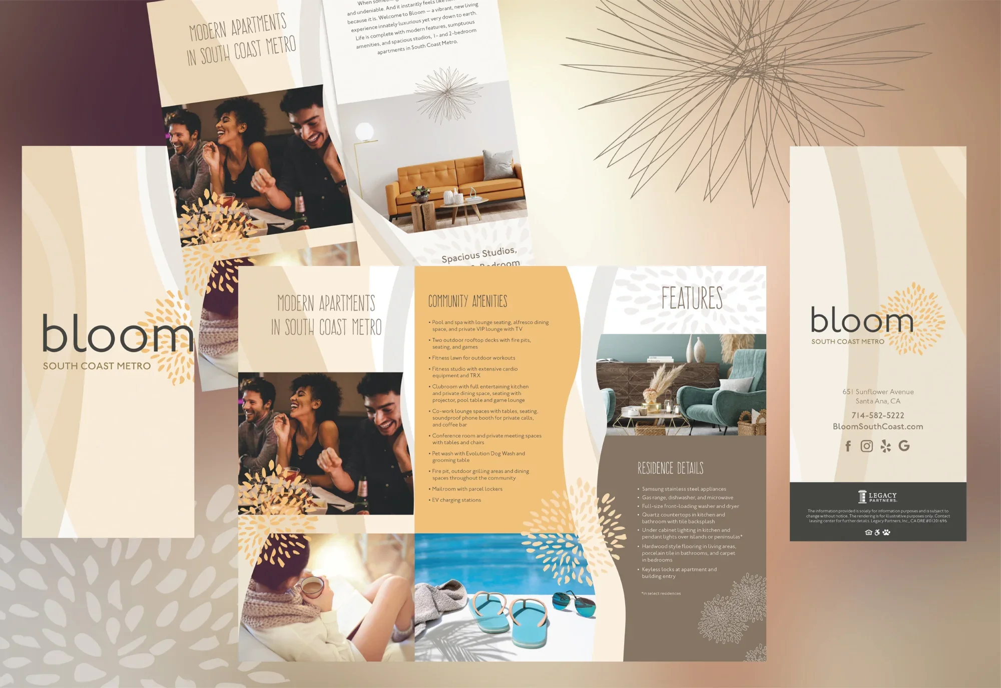
bloom SCM Trifold
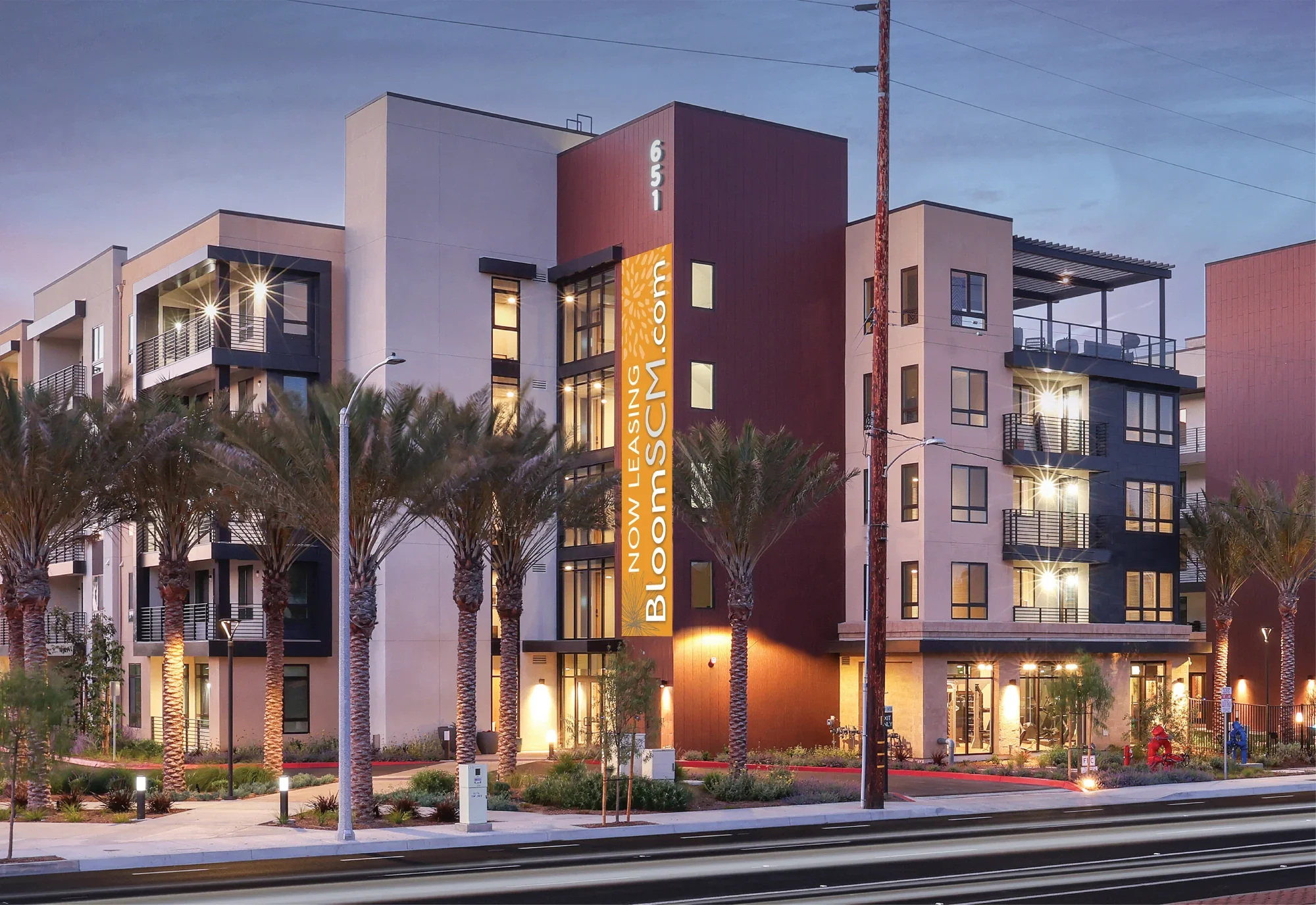
bloom SCM Leasing Banner
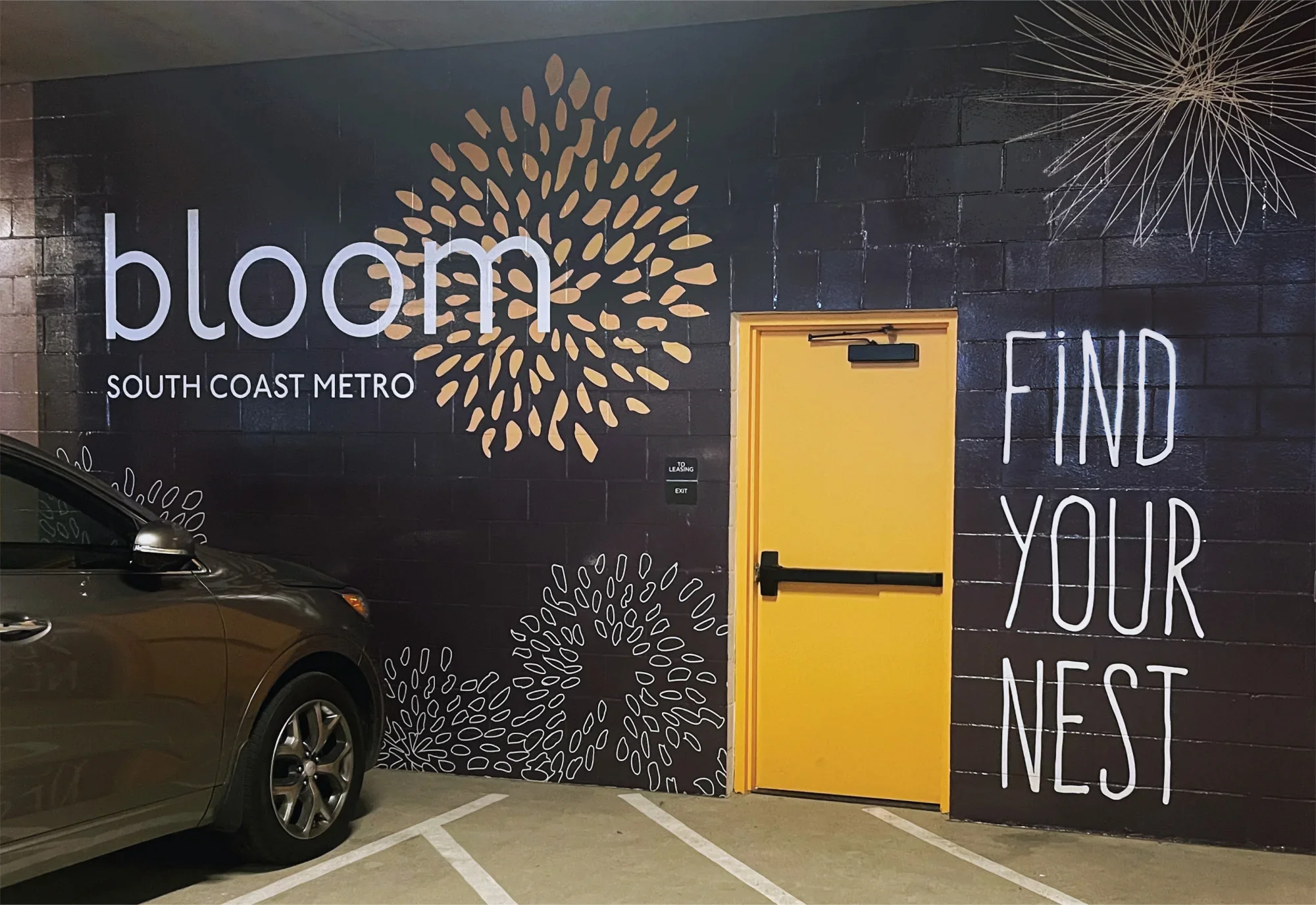
bloom SCM Garage Signage
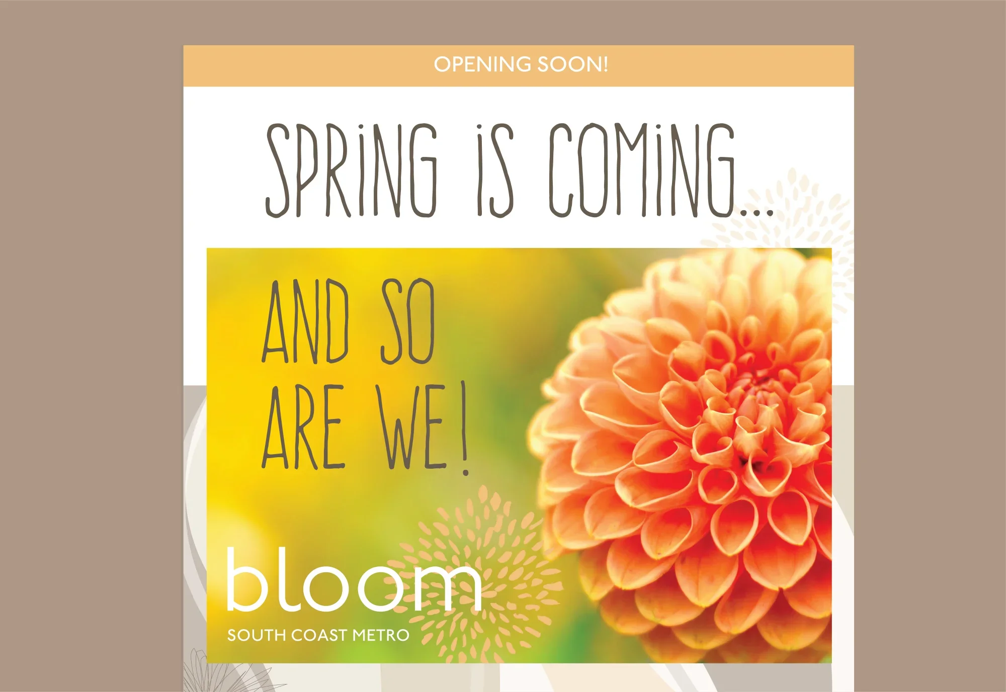
bloom SCM Flyer
bloom SCM Social Card
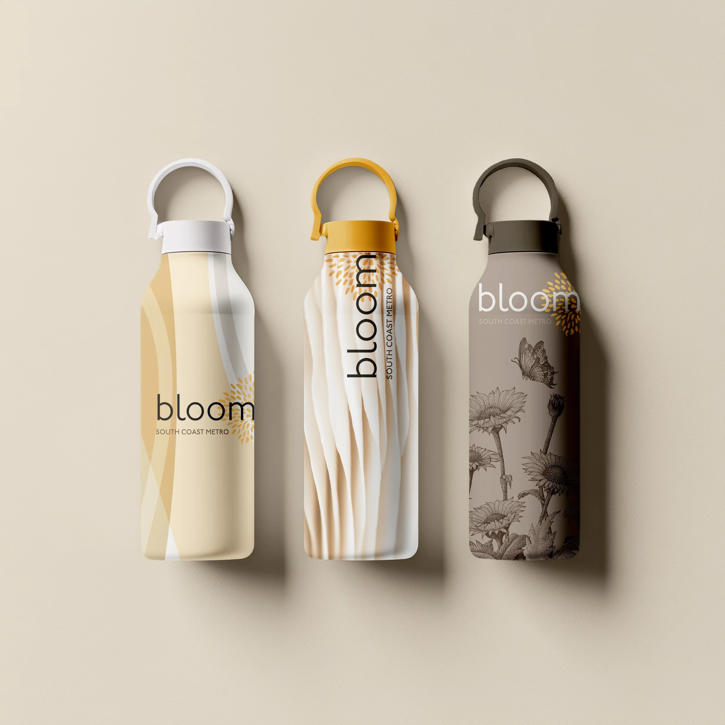
bloom SCM Promotional Item
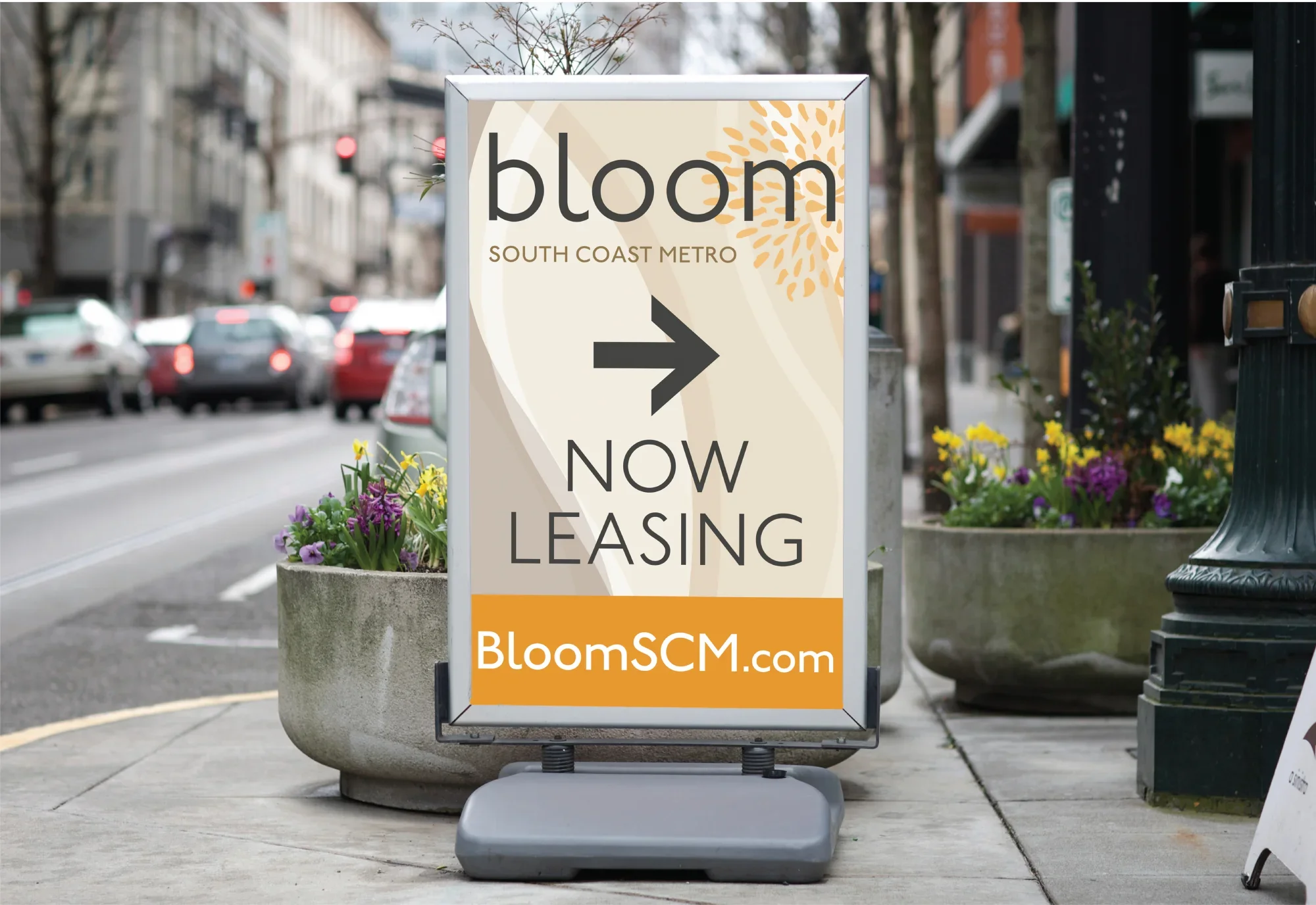
bloom SCM Leasing Directional
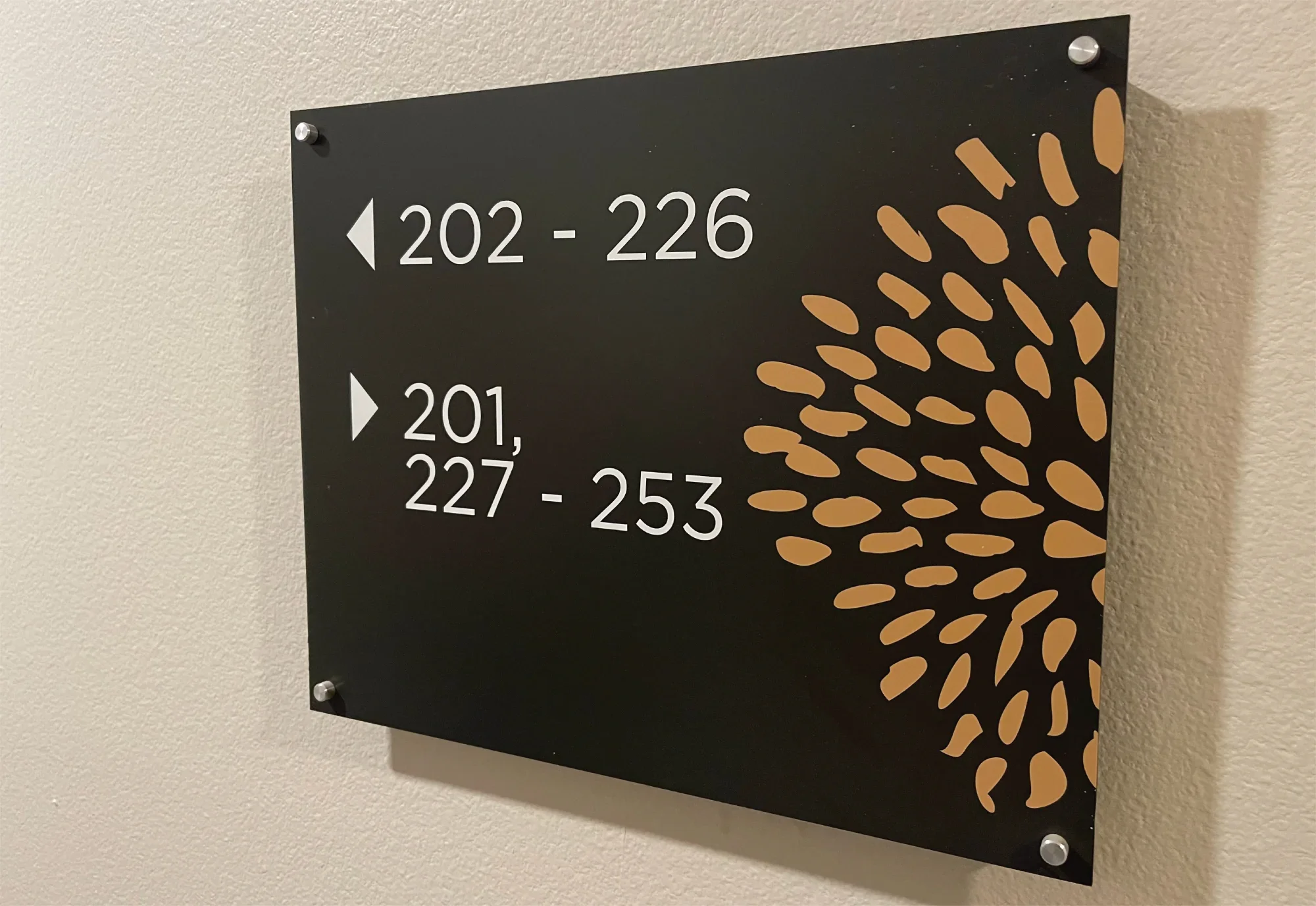
bloom SCM Unit Signage
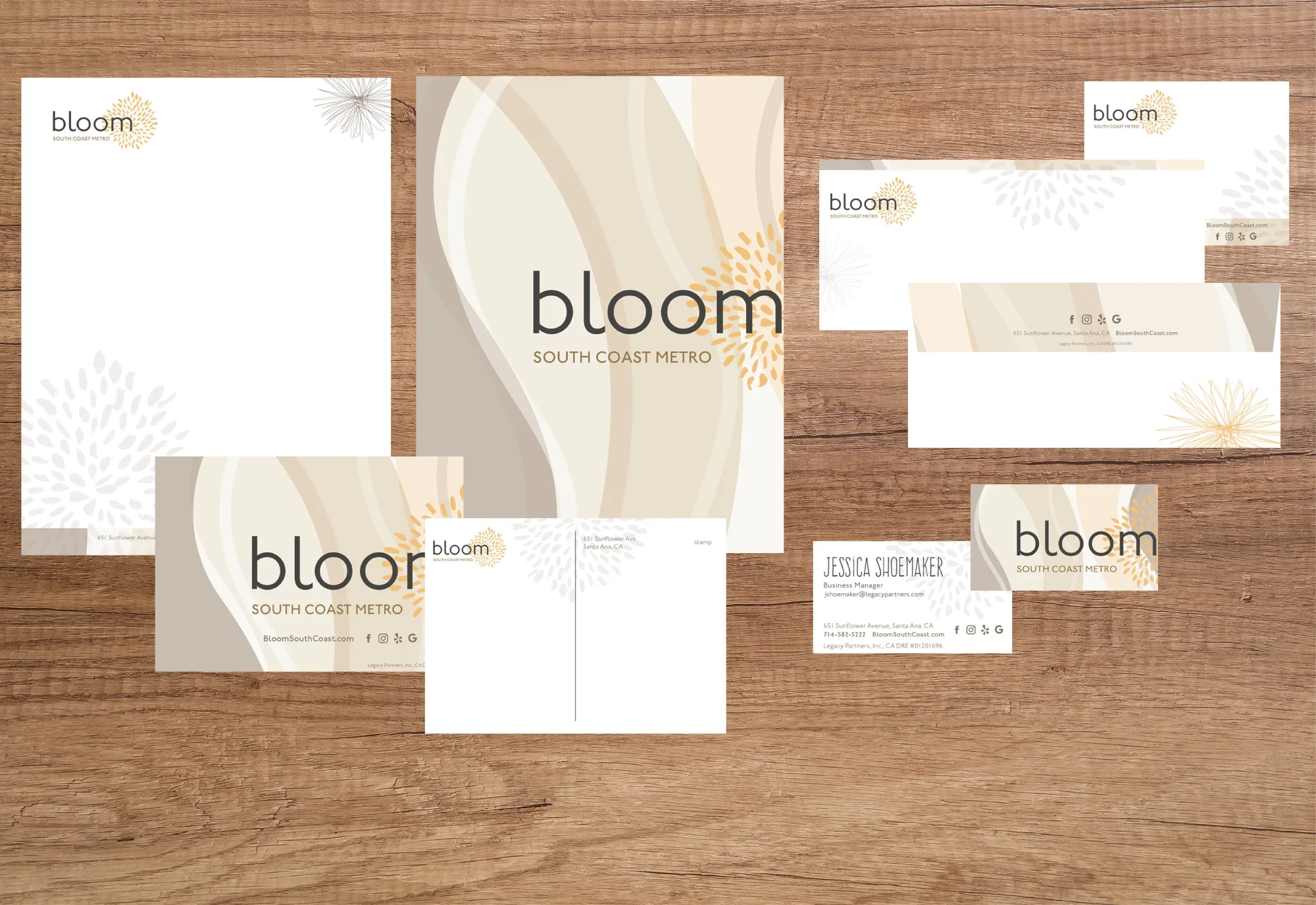
bloom SCM Stationery
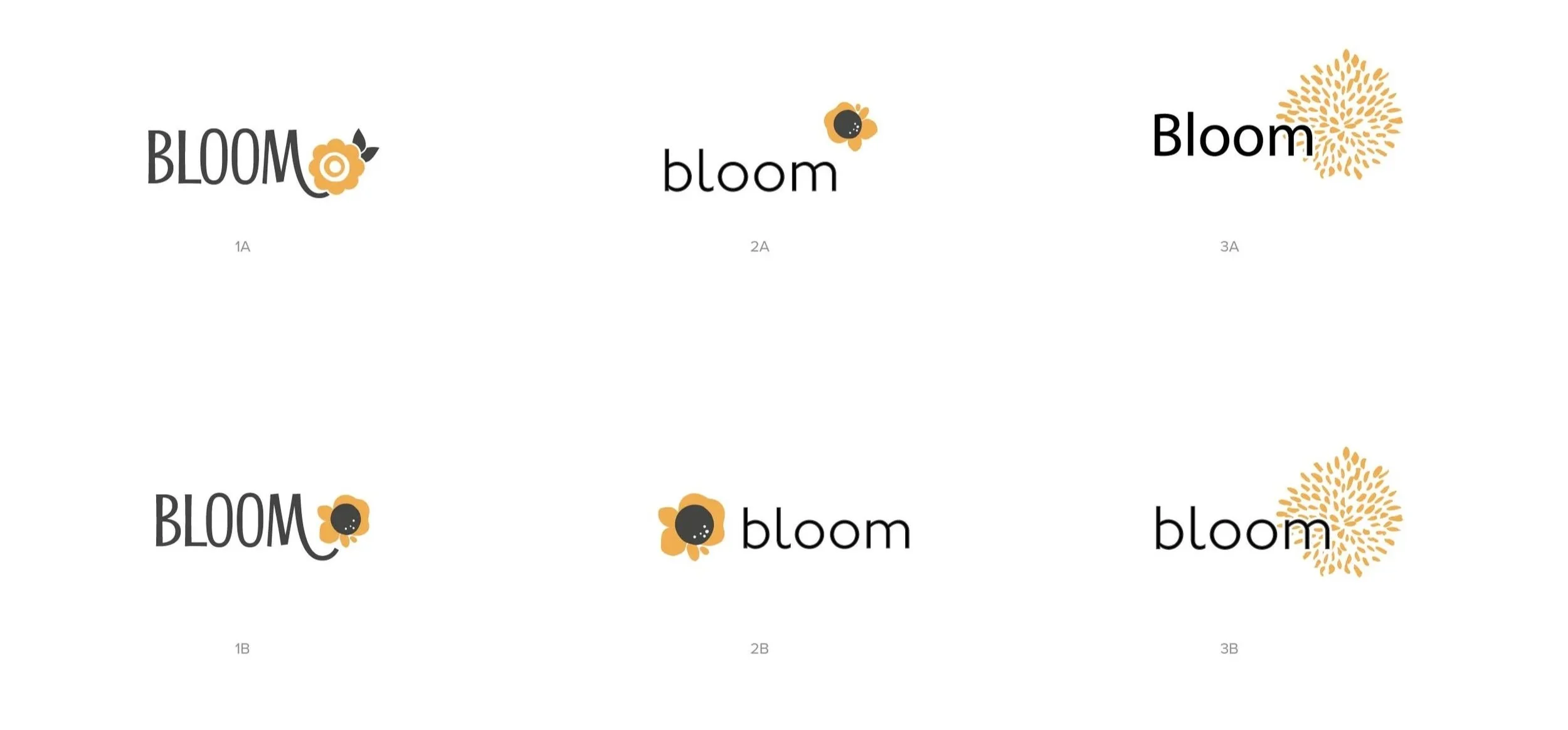
Bloom Logo Study
Brand Identity Inspiration:
Busy professionals in search of tranquility in the hustle and bustle of the surrounding urban landscape can find it at Bloom South Coast Metro with a warm, calming palette, organic vibes of the interior designs, and interpretations of the word ‘bloom’, especially as it relates to the Sunflower Avenue address.


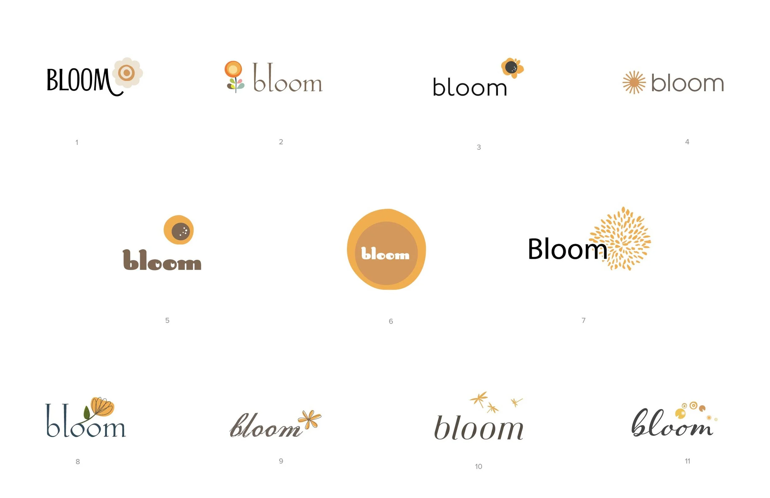
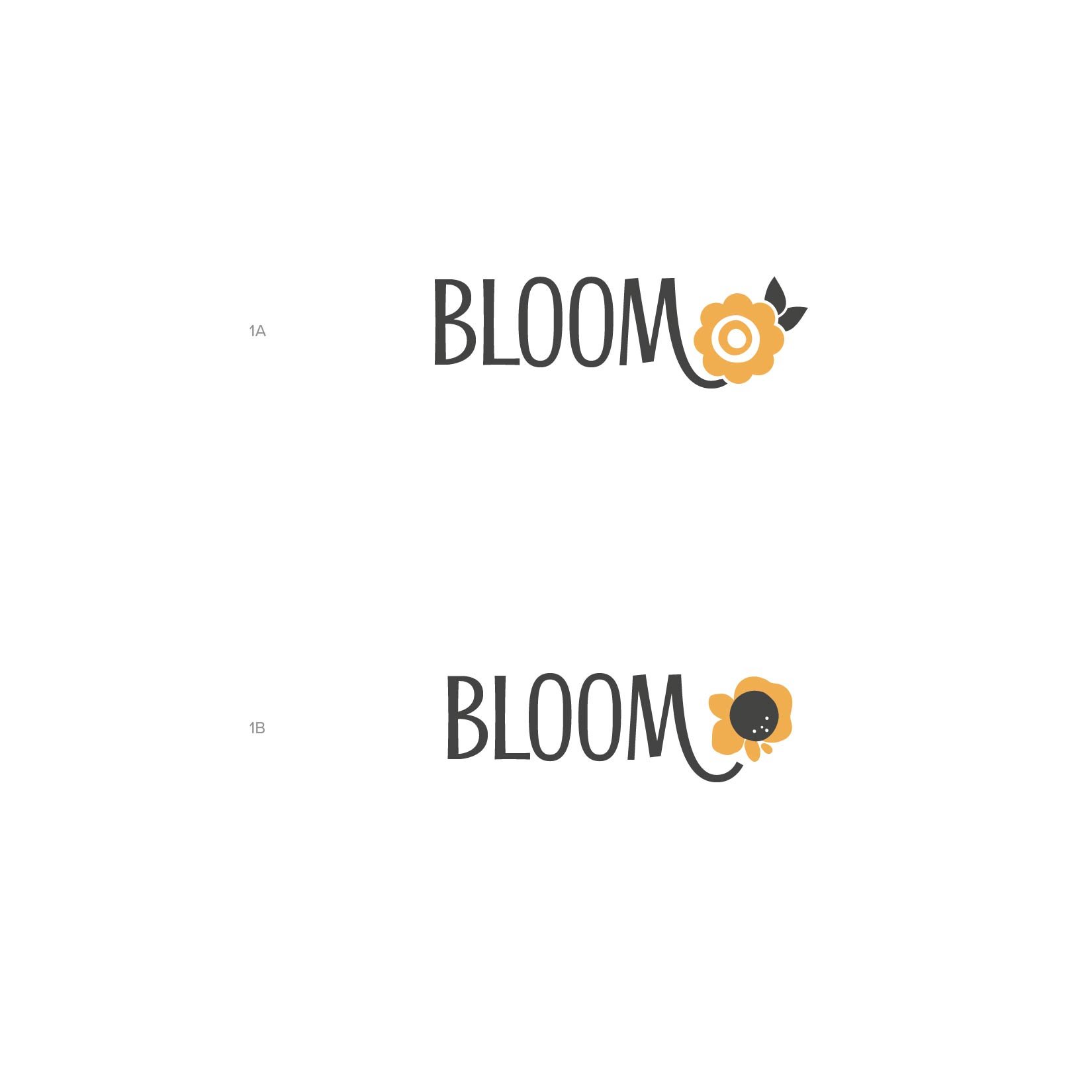
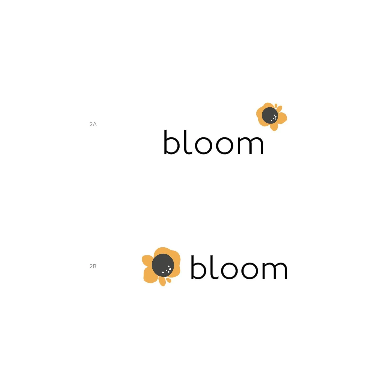
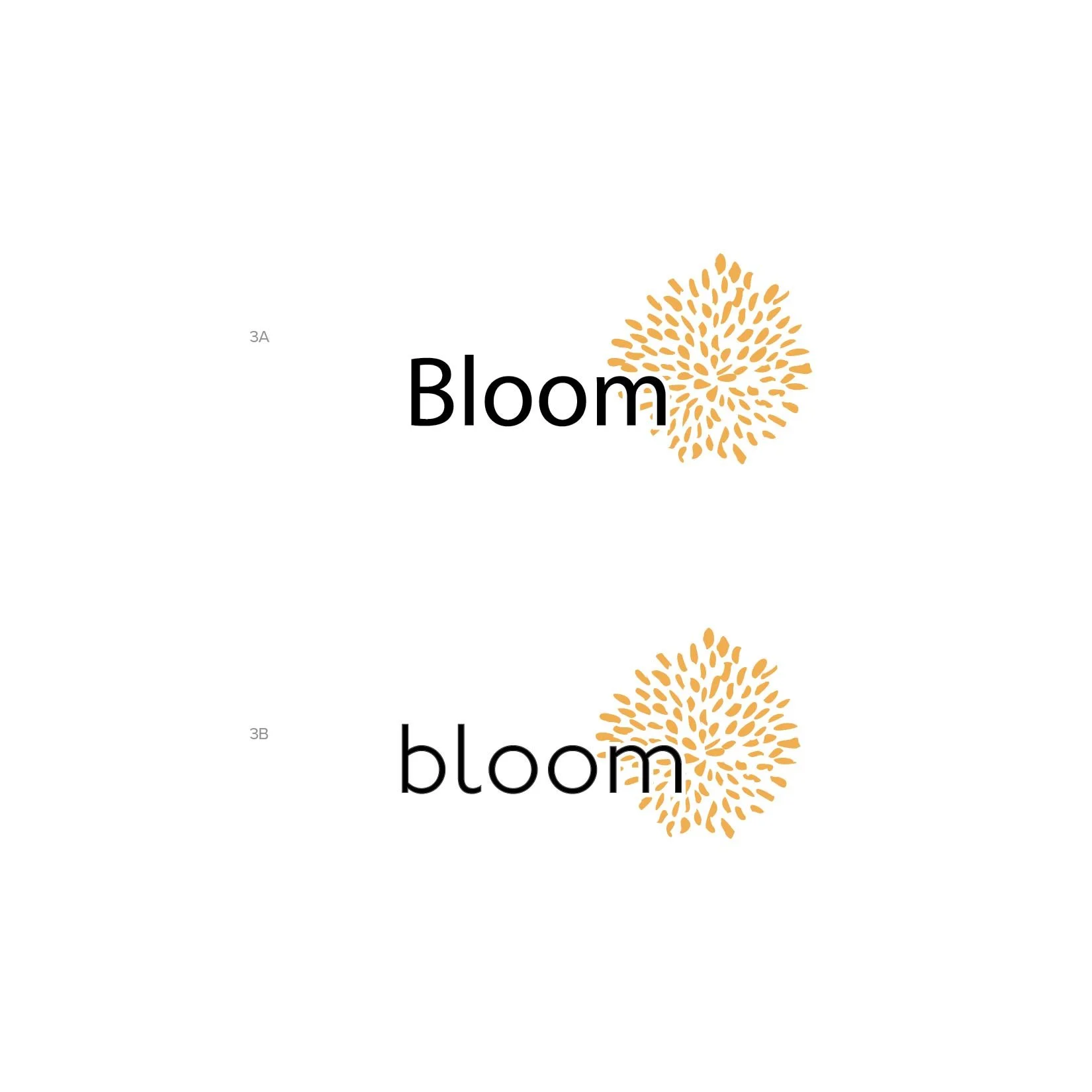
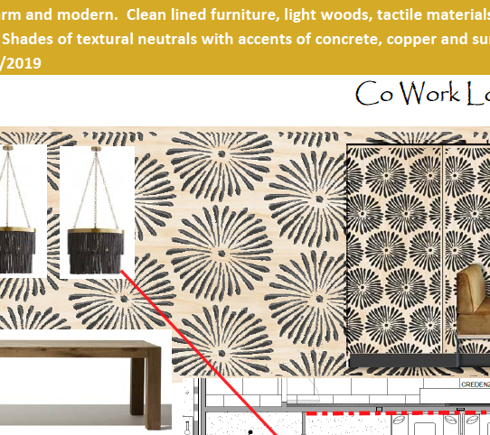
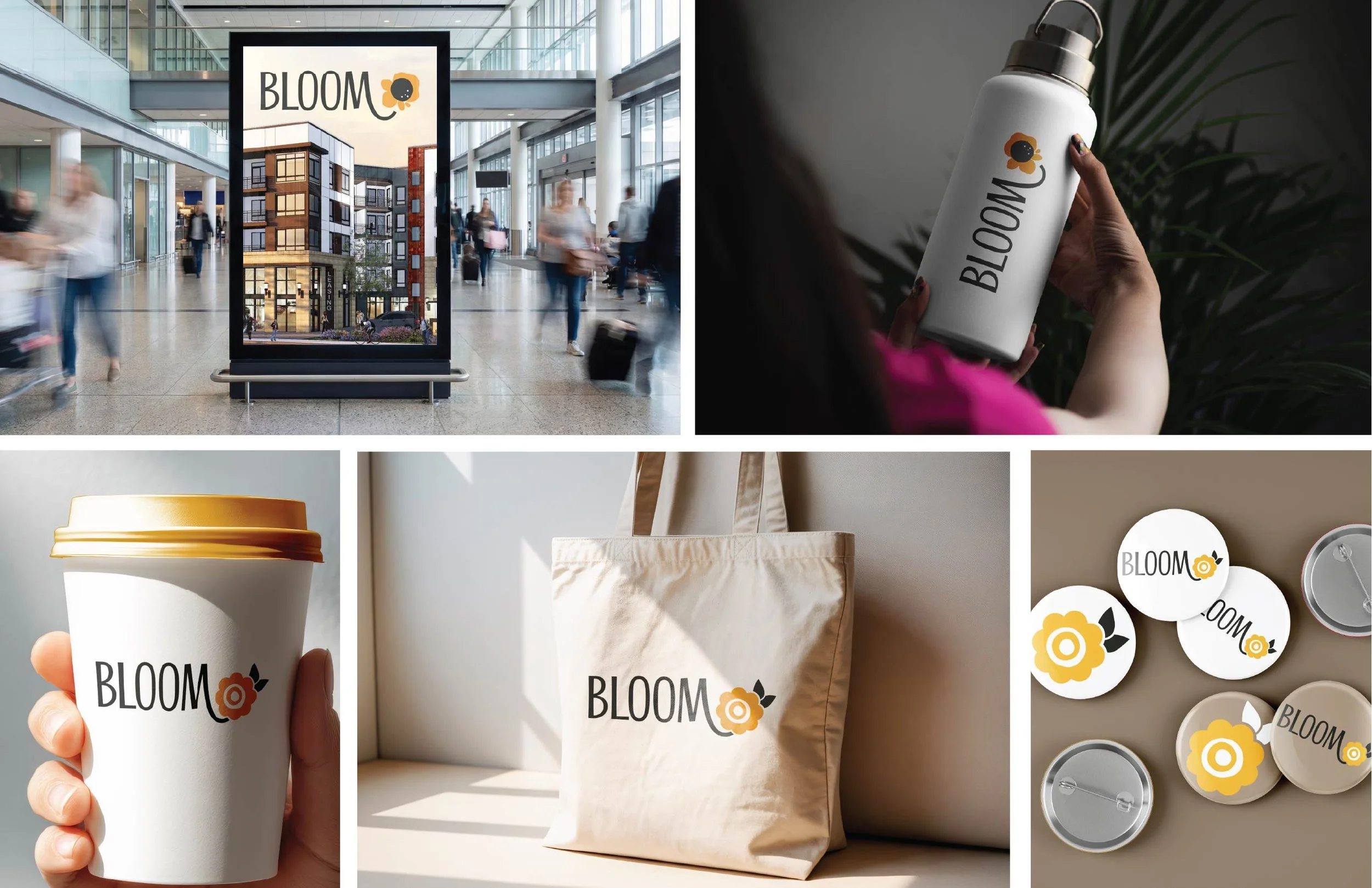
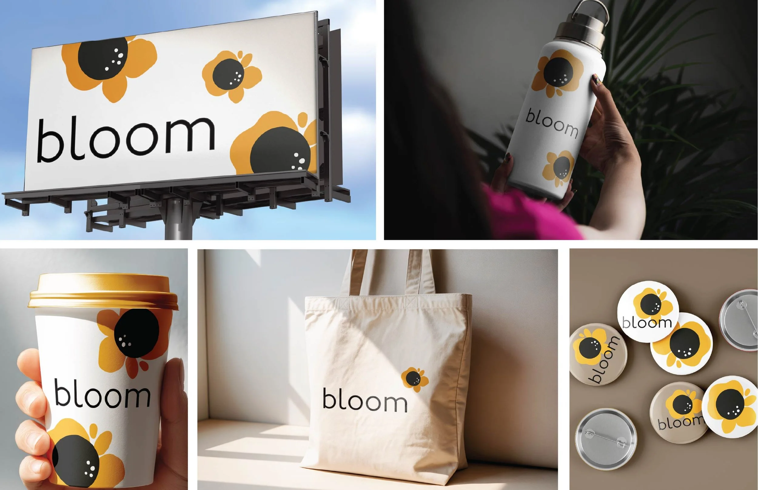
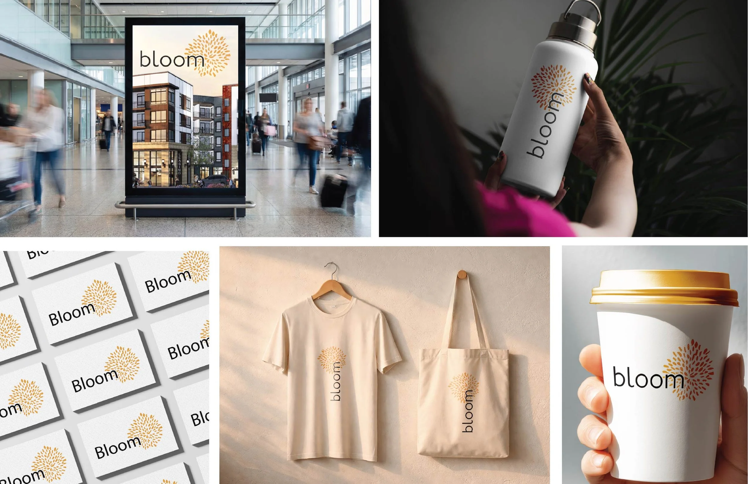
The client narrowed the options to a few favorites, and as it goes, they chose the fonts and marks they enjoyed and asked us to mix and match. Because the direction was focused, this was easily accomplished with the 3 marks and 2 font choices. Showing the narrowed options in context guided them choose the 3B mark.